
California College of the Arts (CCA) educates the next generation of artists, designers, and futurists through critical discourse and purposeful practice. As the school expands upon 116 years of impact in the San Francisco Bay Area, we created an institutional campaign that embraces the plurality and possibilities of now and what’s to come.
Scope
↳ Brand strategy
↳ Campaign identity
↳ Out-of-home
↳ Digital advertising
↳ Social Media
Creative Strategy
↳ Stephanie Smith
Design Direction
↳ Joel Gregory
Photography
↳ Nicholas Lea Bruno
Type Design
↳ Giorgia Sage
01
Concept
The foundation of this campaign is speculative design, a methodology to envision better futures. As the campus expands in San Francisco, the school looks forward into the unknown, just as students and faculty do in their studios. Our campaign reflects this iterative, inclusive, and radical spirit.


02
Elements
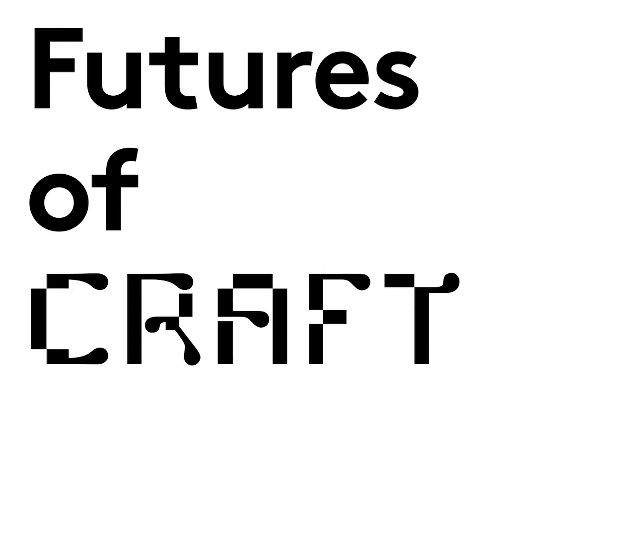
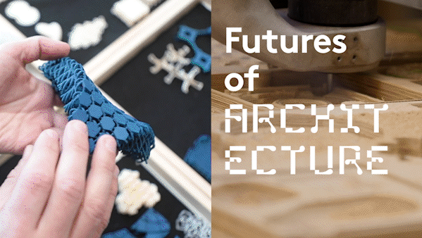
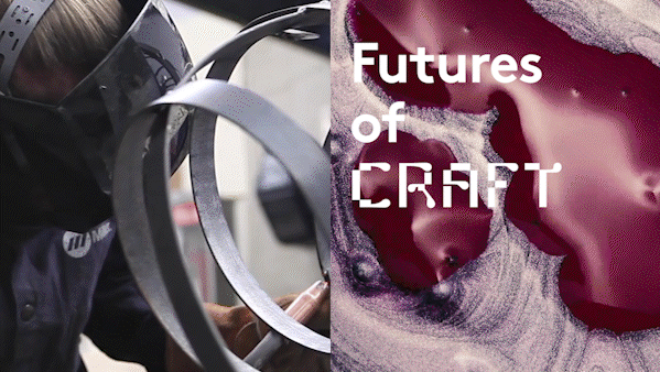
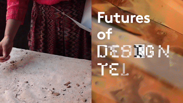
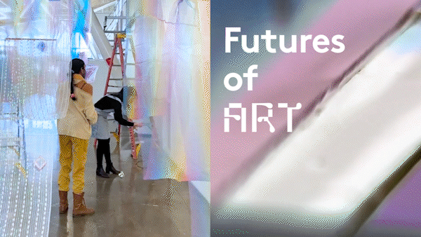
OPEN-ENDED-MESSAGING
Our “Futures of” tagline is intentionally plural, nodding to the fluidity of creative practice and CCA’s growing campus. Our keywords reflect our range of disciplines (architecture, art, design, and writing), concepts (play and interaction), and what binds us together (community and storytelling).
“The first thing that comes to mind when I think about the concept of the future is that there are many futures, you know, there are as many futures as there are people that can imagine the future.”
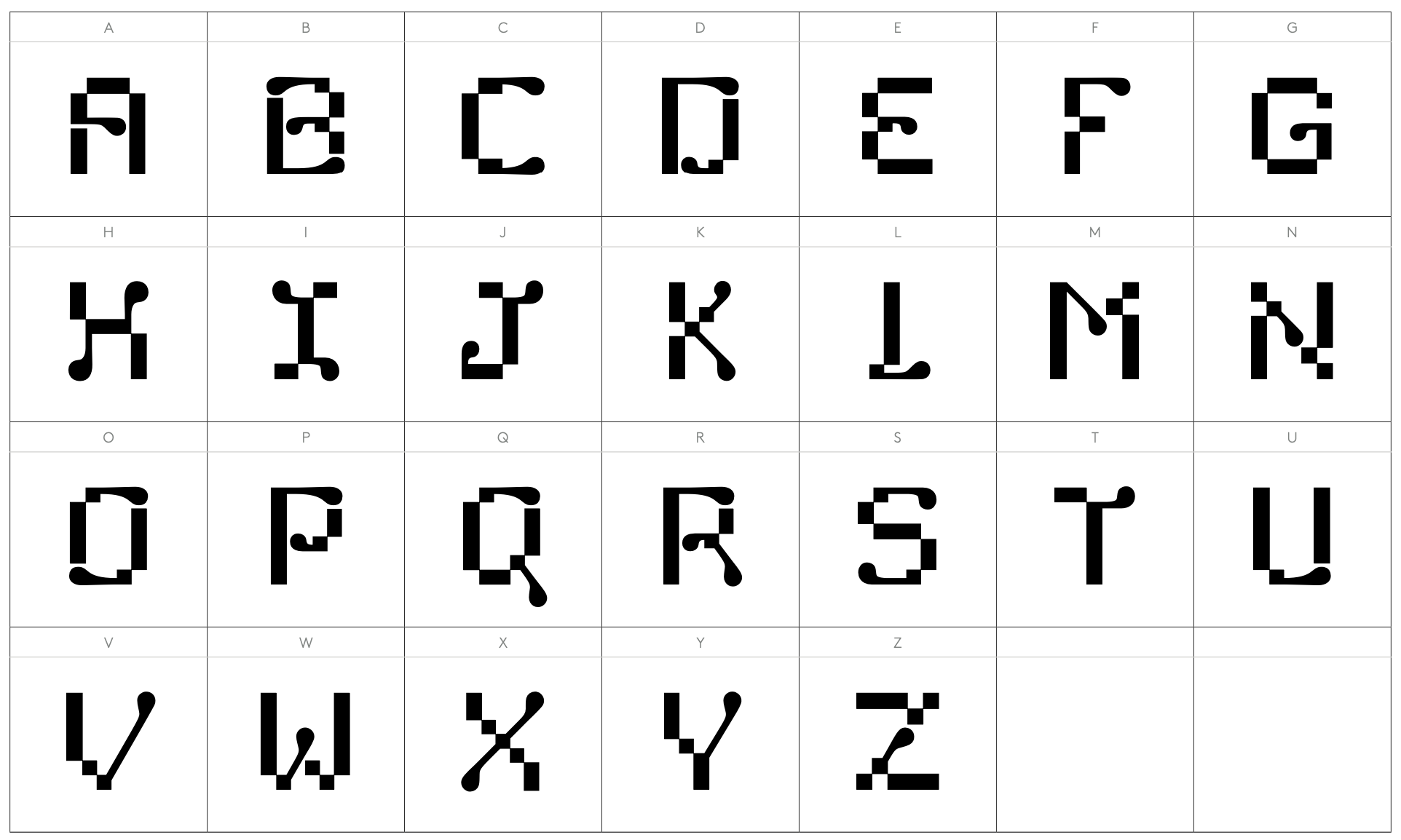

BRAND FONT DEBUT
Just like CCA’s creative culture, Chimera Display embraces multiplicity and interdisciplinarity. The font shapeshifts stylistically between rectilinear shapes and organic forms, referencing CCA’s roots in the Arts and Crafts movement and its current mythical mascot. Chimera Display was created in-house between 2021-22. This campaign is the font’s public debut.


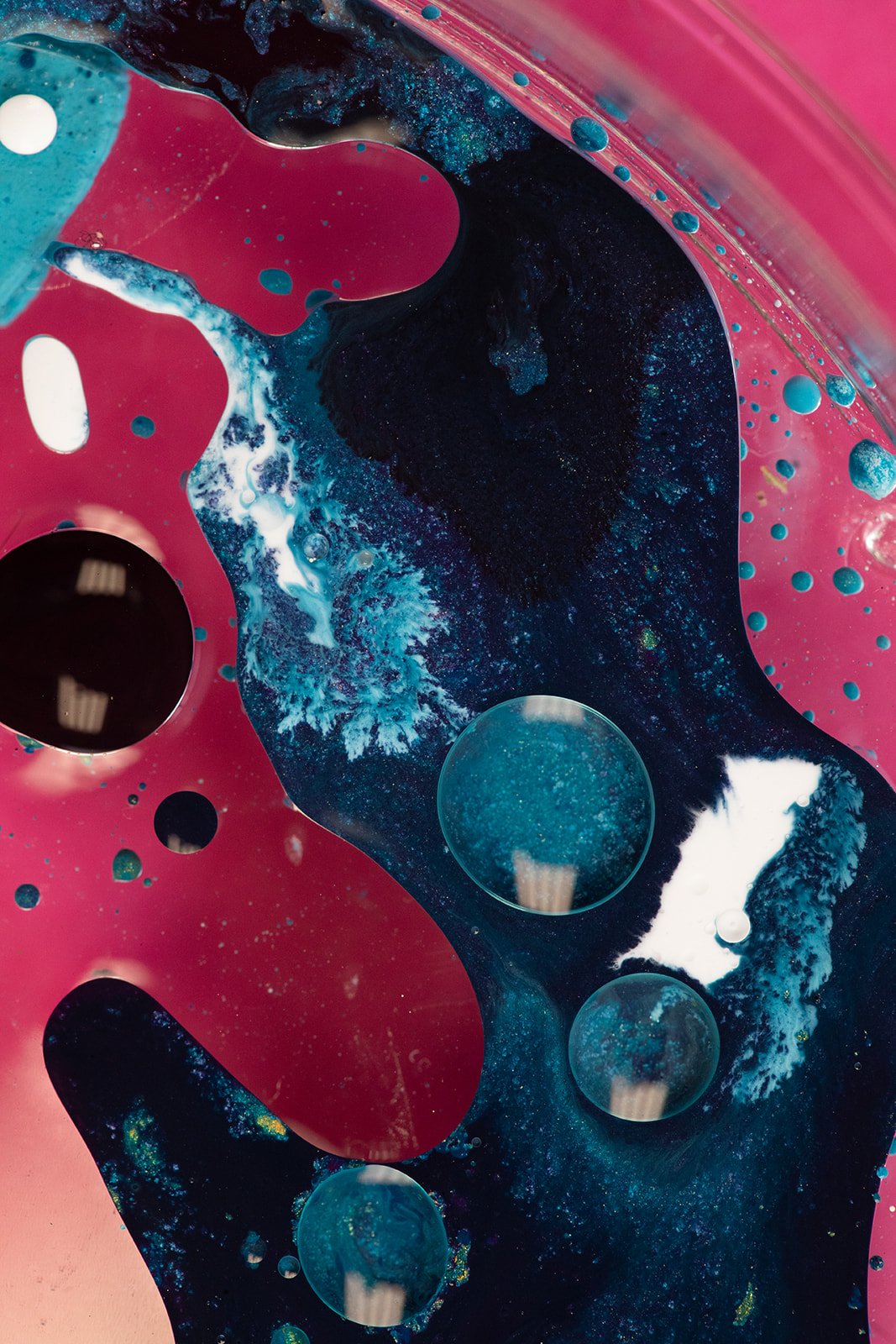

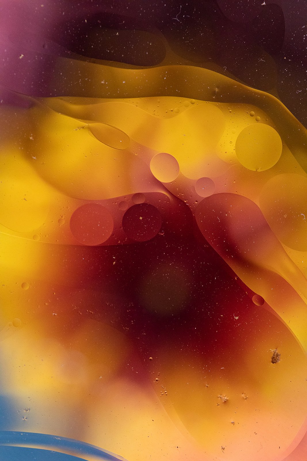

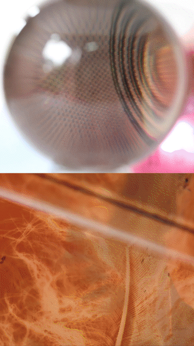
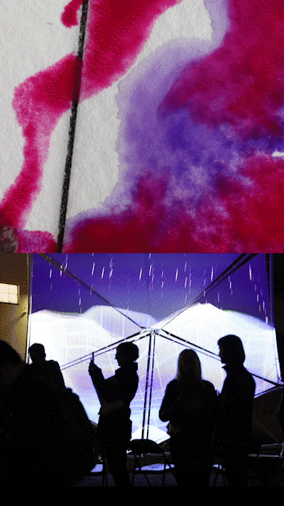
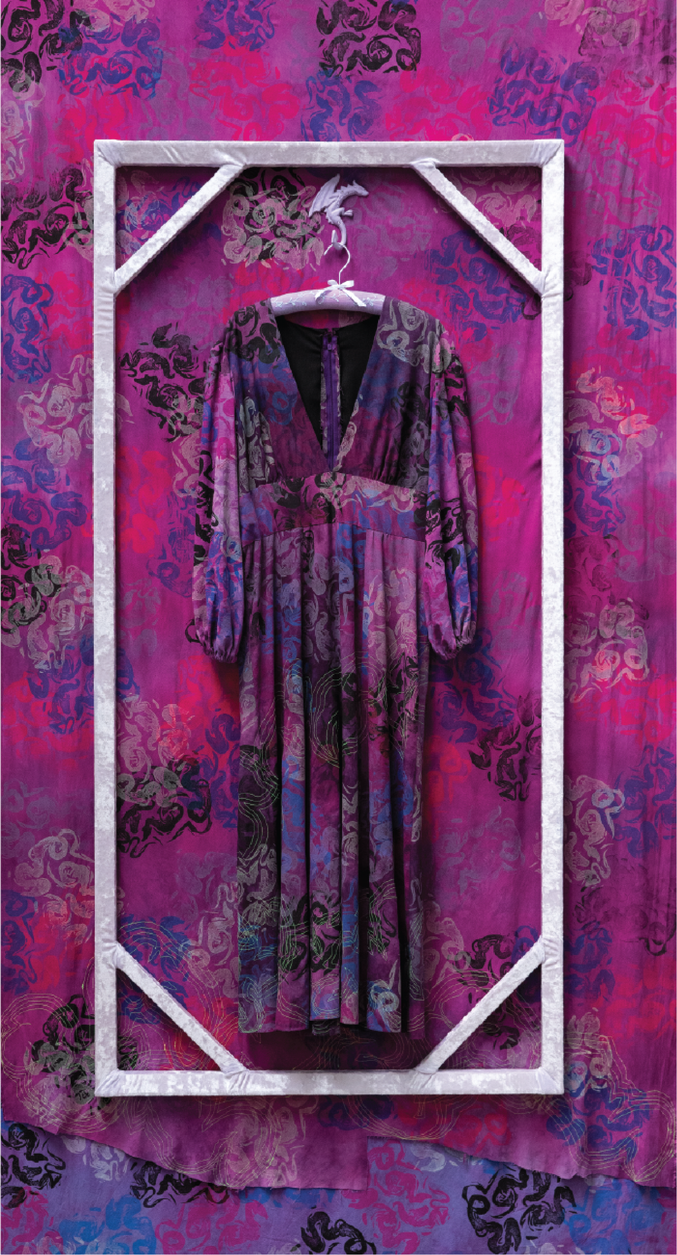
VIEW OF THE MAKER
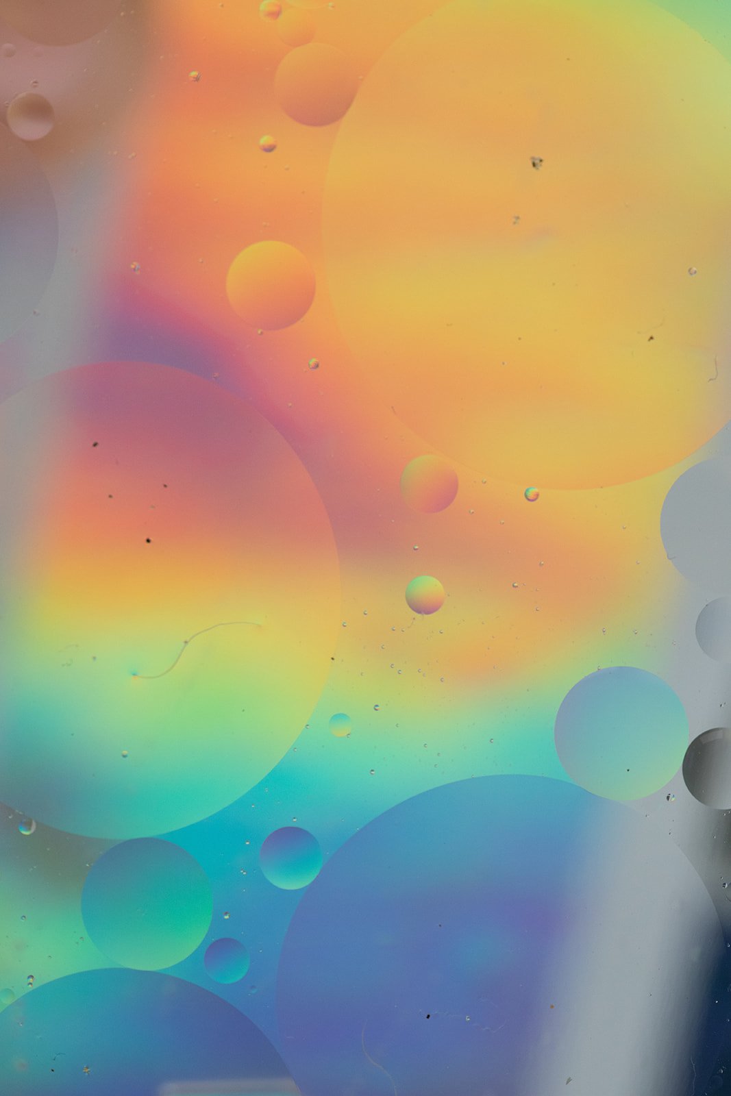
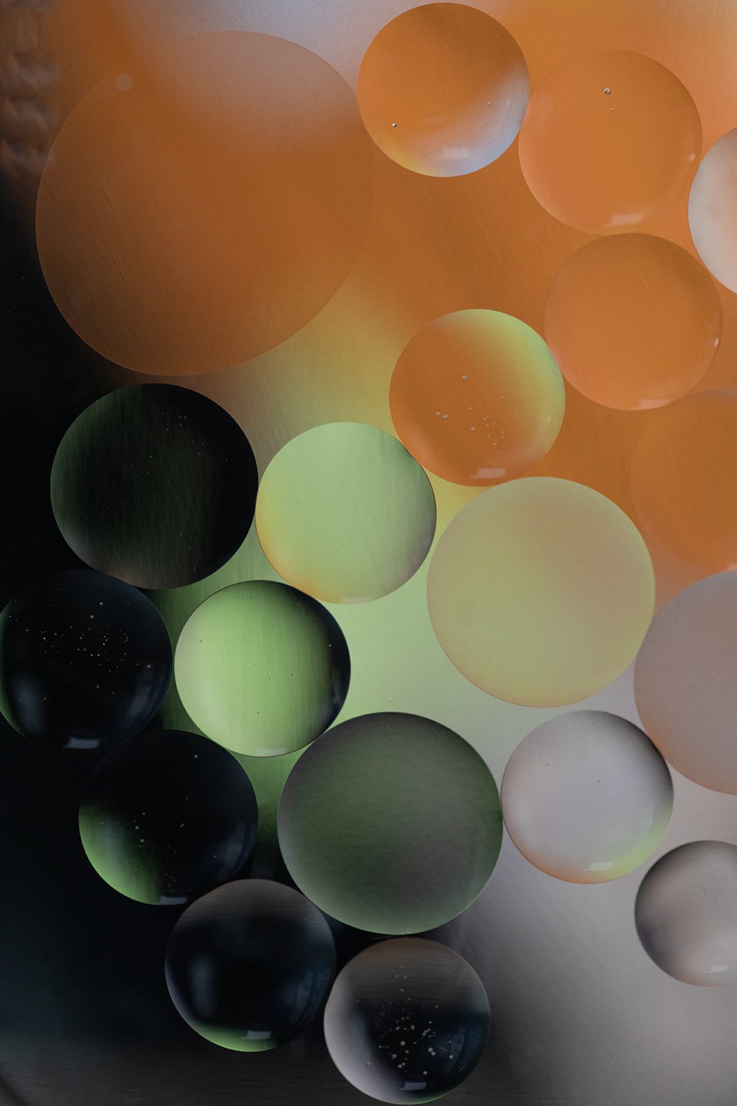
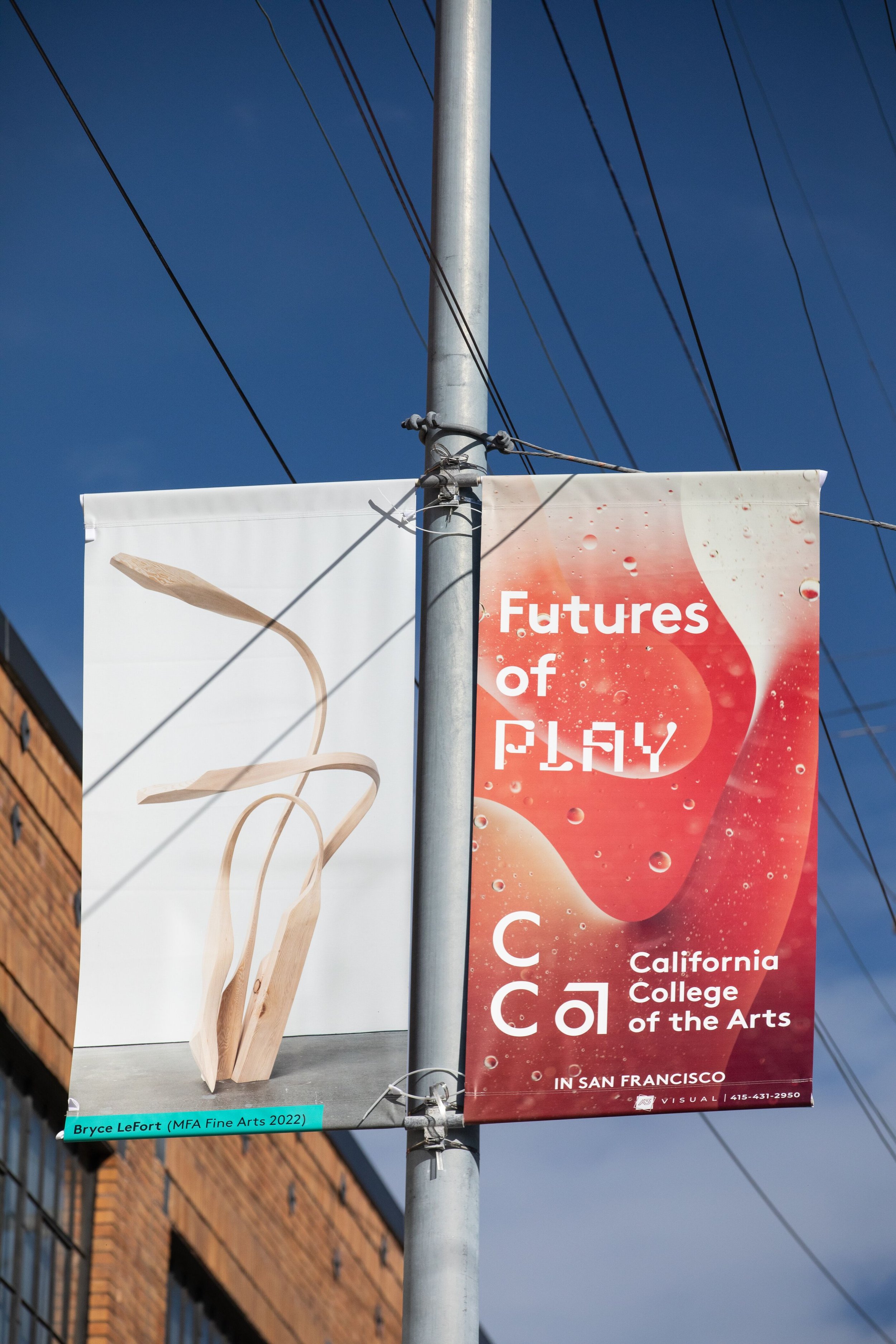
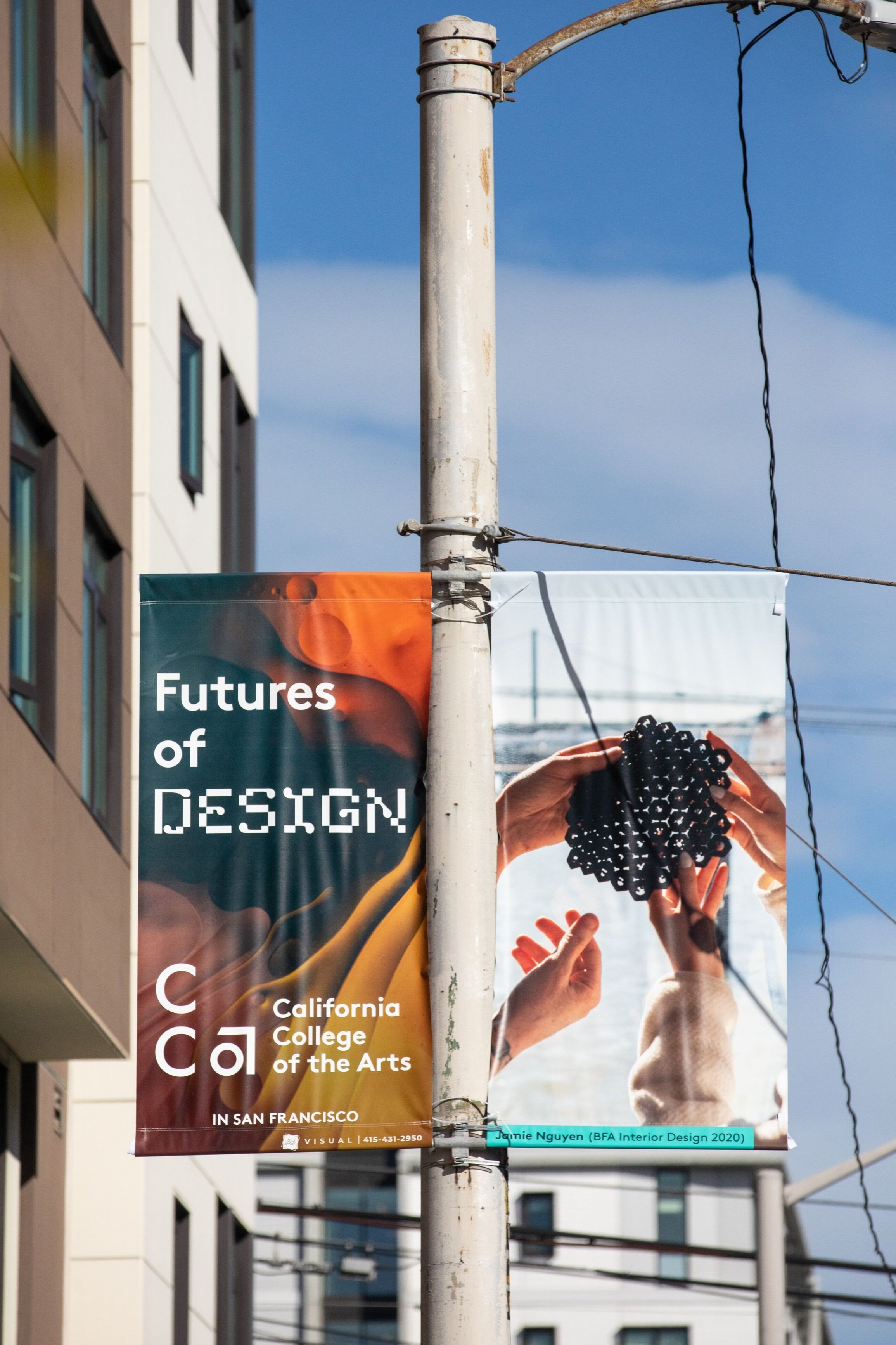
Centering the maker experience, we embrace the textural and experiential qualities of macro photography. Close-ups of paint, film negatives, linoleum carvings, code bases, and more linger on the creative process and the promise of raw materials.
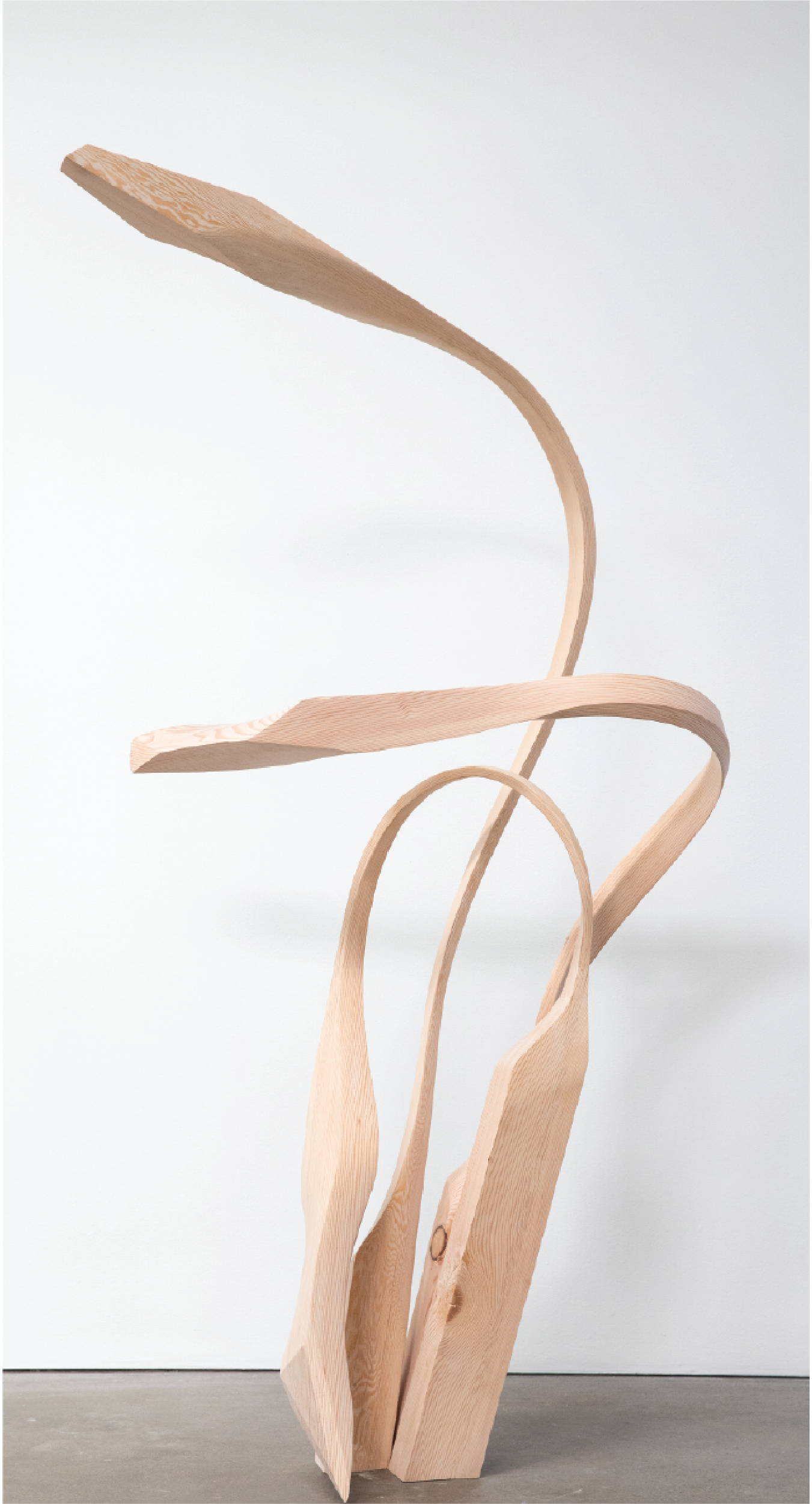
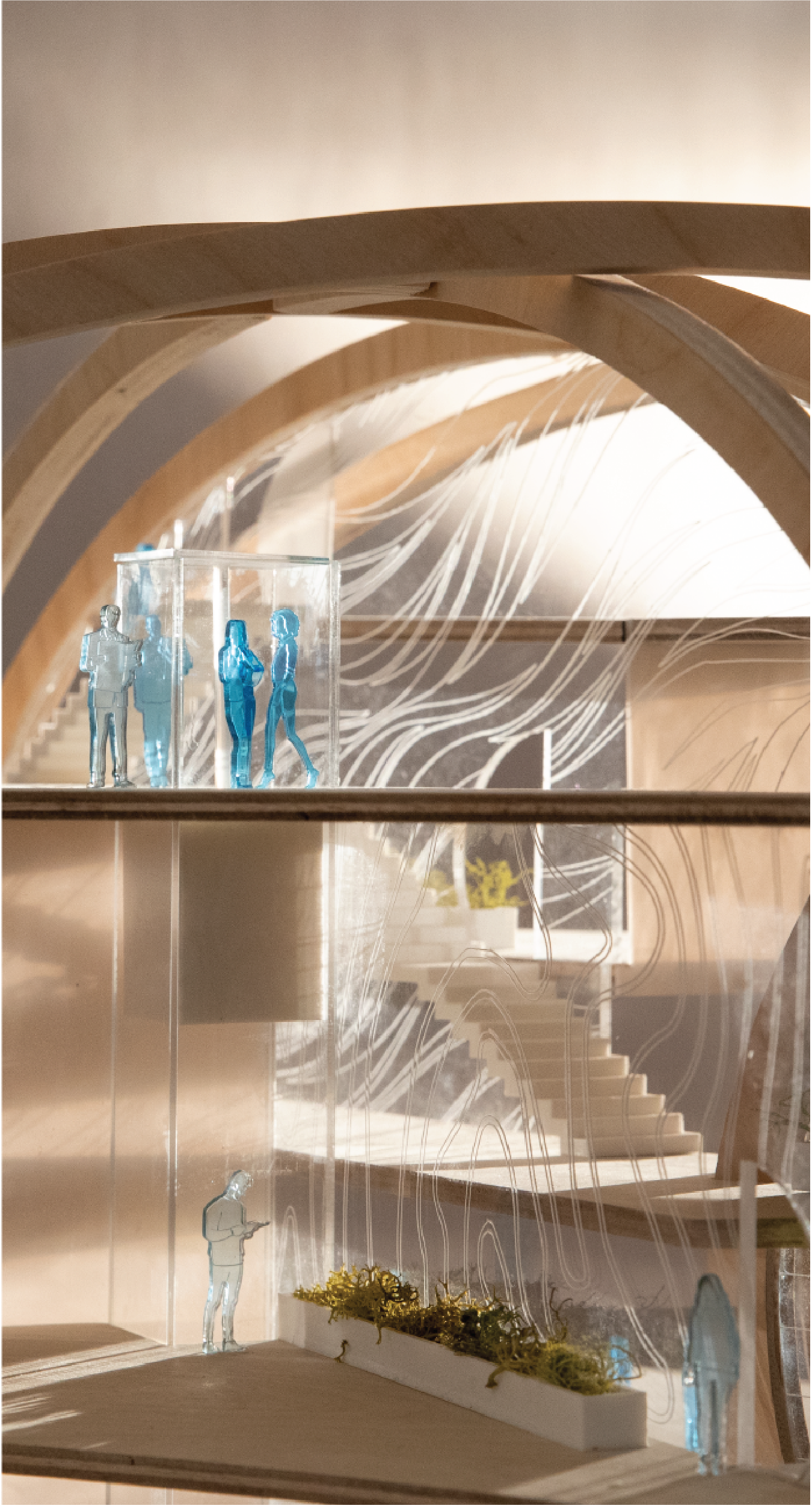
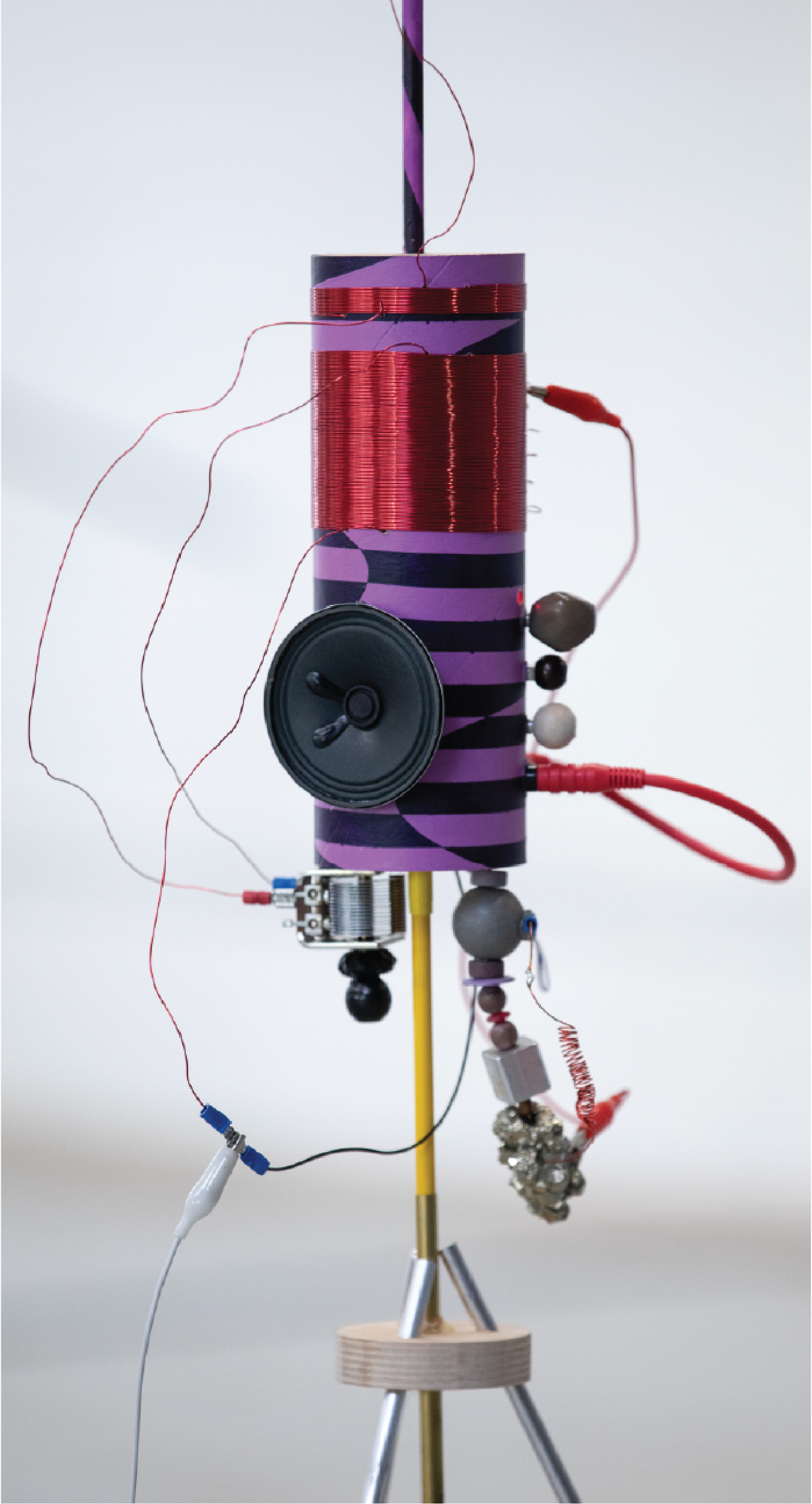
STUDENT AND FACULTY WORK
It also felt important to “zoom out” and celebrate the work of our current community. Student, faculty, and alumni projects add concreteness to the campaign, an element of right now within our nonlinear story about CCA.
03
Outcome
The campaign included environmental, digital, social, and programmatic placements. Each form factor holds space for the possibilities of CCA’s story.

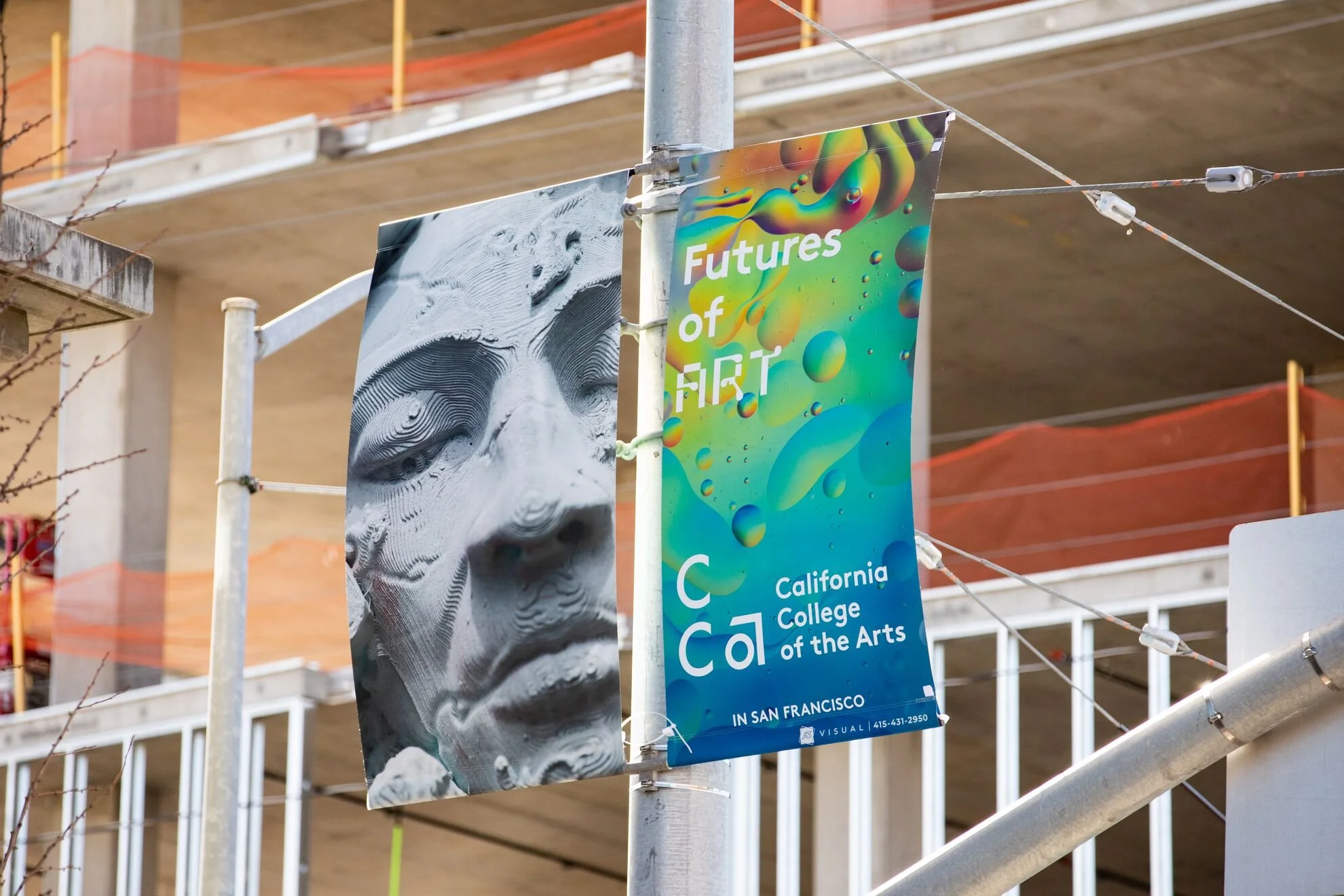
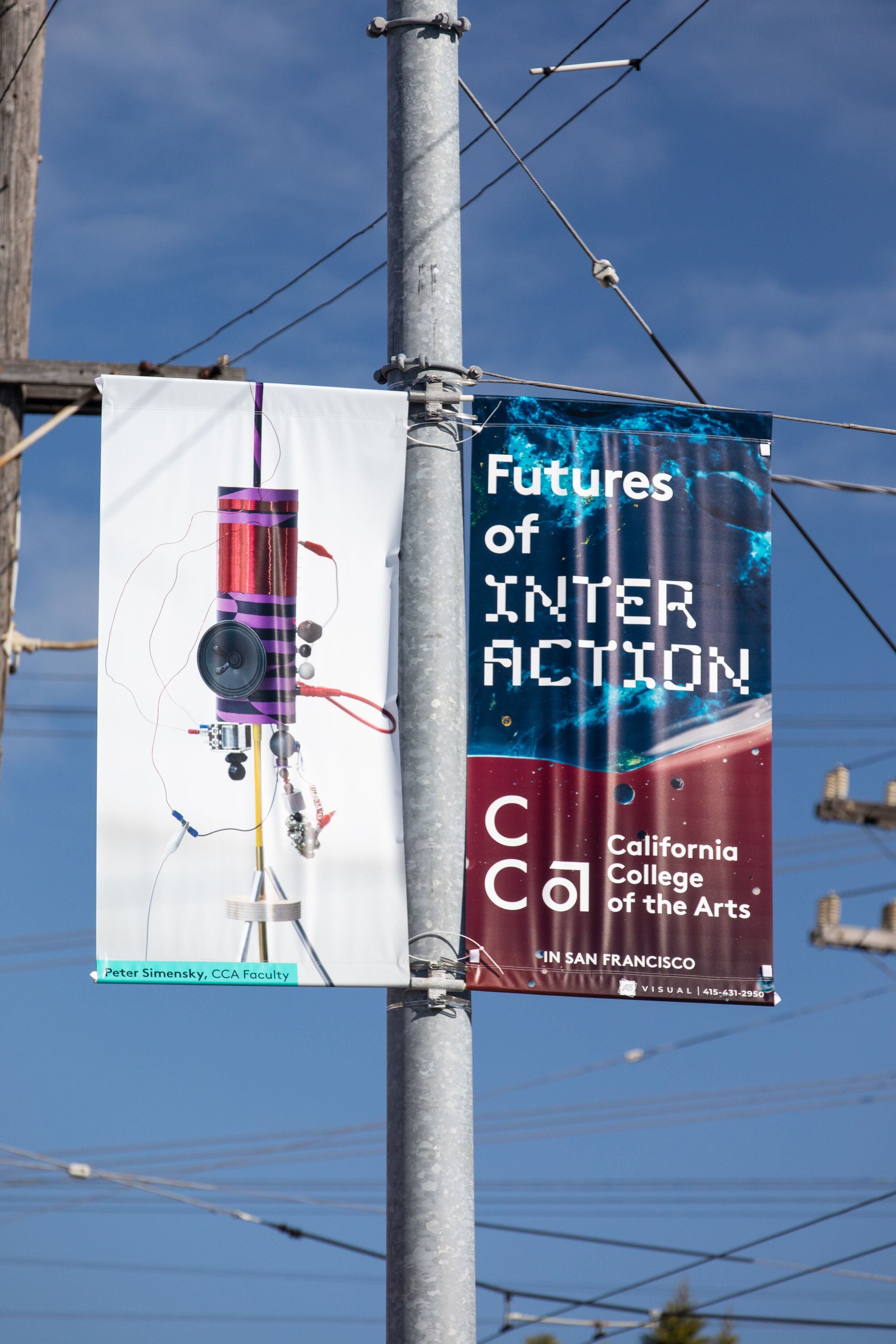
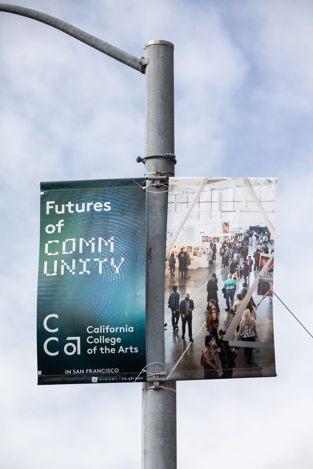
STREET POLE BANNERS
Environmental advertising celebrated our (expanded) footprint in San Francisco. From the Mission to Embarcadero to Dogpatch, locals could see eight variations of our pole banners. Sequential placements along streets and at intersections showcased CCA’s multifaceted mission.


DIGITAL ADVERTISING
Boosting awareness for CCA online, our campaign included responsive display and banner ads. These shorter placements featured focused word pairings — like architecture and community, art and play – to align with keyword and geofencing strategy.
SOCIAL MEDIA
Our social media content concentrated on Instagram Stories, TikTok, and Snapchat. These short-form, vertical vignettes hooked viewers with visuals before text animations of our “Futures of” keywords.